Website layout using grid II
As promised - many months and half a pandemic ago - here it is: The second article in the “Website Layout using Grid” series. This time around, we will take a look at the “tablet” viewport.
I set that in quotes because I am not particularily fond of calling medium-sized viewports “tablets”. I learned web development using the mobile first approach, breaking down websites in three distinct presentation modi: Mobile, tablet and desktop. However, it is very often difficult to distinguish between the three. Pixel numbers alone don’t help, since phone screens can be 4k now, so one would have to go with a combination of pixel sizes and dpi to try to differentiate devices. Or one could try to guess a client device from the user agent by trying lots and lots of device names - which as the developers of the linked library themselves say is very unreliable and should not be used.
The approach I very much prefer is to not categorize clients into groups based on hardware. I don’t care wether you view my website on a mobile phone, on a desktop computer or on a smart fridge. What I care about is that my content is readable. And for that, only one thing matters: Wether the screen is wide enough to fit my text. Following this approach, I set my breakpoints based on rem - the font-size on the root element. This makes my breakpoints automatically respect zoom and makes the content fit on all kinds of devices.
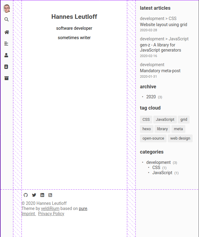
But enough of that tangent, you’ll see what I mean soon enough. This time, let’s start with a screenshot and work from there:

The main difference from the mobile layout is that we have much more space available than is actually needed for readable content. Among designers, it seems to be common knowledge that column widths between about 45 to 75 characters per line are the most satisfactory to read. I don’t know what this knowledge is based on, whether it’s empirical or not, but I’m neither a ux designer nor a cognitive psychologist and thus trust the knowledge of the more experienced. So I set my breakpoint for the tablet layout at 45rem. This, in my setup, translates to at least 37rem space for the main content. Since rem denotes the height of the font, this translates to around 50 characters per line. So I’m on the lower end of the recommended width spectrum.
Let’s see some code:
@media only screen and (min-width: $md-min-width) {
  body {
    grid-template-areas:
      "header body sidebar"
      "header footer sidebar";
    grid-template-columns: $md-navigation-width auto $md-sidebar-width;
    grid-template-rows: auto max-content;
    grid-column-gap: $md-body-padding-x;

    padding: 0;

    overflow-x: hidden;
  }
}
We apply the new layout at a minimum screen width of $md-min-width, which is 45rem. Since I reduce the main content to around 37rem in the smallest possible presentation of the tablet mode, we have quite a bit of space around the content for sidebars - but not enough space for two full sidebars. Because of this, the navigation is still not completely visible, but replaced by a bar of icons. These icons are important - they should convey their purpose as clearly as possible, since the navigation is otherwise unusable. The sidebar is more important than the navigation content-wise, since it helps visitors graps the amount of content in the entire blog and gives an overview of the available topics as well as the most recent posts. It is also much more difficult to condense this sidebar into icons - so the sidebar has more priority here than the navigation and gets the space.
In the grid areas the header now moves to the left side - the name is a remnant from the mobile layout. The sidebar on the right is new. The footer is now in the center, below the body and will always be the last thing visitors see, when they scroll to the end of the site.
@media only screen and (min-width: $md-min-width) {
  .header {
    background-color: $sidebar-background;
    border-right: 1px solid $sidebar-border;
  }

  .main {
    width: calc(100vw - #{$md-sidebar-width} - #{$md-navigation-width} - 2 * #{$md-body-padding-x});
    max-width: 40rem;
  }

  .sidebar {
    display: block;

    padding: 0 1rem;

    background-color: $sidebar-background;
    border-left: 1px solid $sidebar-border;
  }
}
The header now gets a slight background color change and a border on the right to set it apart from the main content. The width of the main content is carefully calculated, so that all three elements fit next to each other, the sidebars keep their sizes and the content scales with the viewport.
And last but not least, the slightly extended html:
<body>
  <header class="header">
    // Navigation and similar things go here
  </header>
  <aside class="sidebar">
    // Sidebar with tag cloud and other recent things
  </aside>
  <main class="main" role="main">
    // This is for the content
  </main>
  <footer class="footer">
    // And this is for copyright, imprint etc.
  </footer>
</body>
To summarize:
On tablets - or medium-sized viewports - we have more space than we need for content. To use it efficiently, we want to display a sidebar that given an overview of the site’s contents. We don’t want to hide the navigation behind a button click anymore, so we display it in a small sidebar with icons, which have to be as expressive as possible. If the sidebars are well visible and do their jobs, the content can scale freely up until the next breakpoint.
And that’s it for this post. The next one will be the last in this series and about the desktop - or large-sized - viewport. Let’s see if it takes another five months and another pandemic for the next one to appear ;)