Website layout using grid
CSS grid is probably the most useful improvement that has been made to the CSS standard in recent years.
Once upon a time the <table> layouts were the way to go. They made optically structuring the website relatively simple - with the downside that they severely mixed data structure with presentation.
Skipping a few steps, the next major layouting tool that was used were floats. This was - finally - a CSS based layouting approach in which element were arranged into layouts by making them float to one side of the page and ordering the remaining elements around them. This made it possible to build sidebars and menus - but brought huge complexity with it.
Skipping a few more steps, we’ve finally arrived at css-grid. This mimics in some parts the olden times tabular layouting structure, but gives developers much more control about row heights and column widths as well as element placement within those and especially across those.
To illustrate this, we’ll analyse this page’s current layout. An important thing to note for the next sections to make sense is that this page basically has three different layouts. Which one is shown to you depends on the size of your device’s viewport. The three layouts can be thought of as a desktop layout, a tablet layout and a mobile layout - but they are a little more fluid than that.
We’ll start with the mobile layout, since it is the simplest one and also because I’ve built this site mobile first. That means I started with the mobile layout and when progressing to bigger screens new rules are added that take precedence over the smaller screen’s rules. The gist of the mobile layout is:
body {
  display: grid;
  grid-template-areas:
    "header"
    "body"
    "footer";
  grid-template-rows: max-content auto max-content;

  min-height: 100vh;

  margin: 0;
  padding: 0 #{$sm-body-padding-x};
}

.header {
  grid-area: header;
}

.main {
  grid-area: body;

  width: calc(100vw - 2 * #{$sm-body-padding-x});
}

.footer {
  grid-area: footer;

  margin-bottom: 1rem;
}<body>
<header class="header">
// Navigation and similar things go here
</header>
<main class="main" role="main">
// This is for the content
</main>
<footer class="footer">
// And this is for copyright, imprint etc.
</footer>
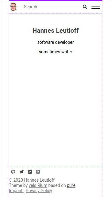
</body>This is only the core part that sets up the grid layout as depicted by the purple lines in this image:

On a sidenote: I recommend the firefox developer tools for visualizing css grids.
Let’s take this apart. The body is in my case the outer container for the layout and thus gets the display: grid; property. On the body we also define the grid-template-areas as three rows - one for the header, one for the (ambiguously named) body and one for the footer. Then the grid-template-rows property sets the heights of those rows. max-content here makes the element fit to its contents size. This property is not supported on older browsers like IE11, but I don’t care about those ancient things.
Then, to tell the browser which element should be placed in which grid area, the element .header, .main and .footer each get a grid-area property corresponding to the area name in the body element.
The height: 100vw; property on the body makes the layout always take up the entire viewport. If the body has more content than can be displayed, the body will overflow and scroll as a whole. This means that the footer will be pushed off the screen and visitors must scroll to read it. This ensures that the content gets all the space it needs.
And last but not least, the padding and margin on the body are set to zero, with the expection of horizontal padding. I want the content to have some distance from the viewport sides, so that the letters don’t stick to the border and have better legibility. I use a scss variable for the horizontal padding and this variable is again used in the .main element’s width calculation.
So far we’ve obviously left out the entire header, navigation, content styling and the (on mobile invisible) sidebars. But this post is entirely about the css grid that drives the underlying layout, so I won’t go into detail on header and navigation.
That’s it for this time. We’ll get to the “tablet”-layout in the next post.